In this tutorial, we will learn how to quickly adjust Brightness and Contrast without making permanent changes to the image. Leaving the possibility of further editing.
Unlike Auto Tone, Auto Contrast, and Auto Color, which offer no fine-tuning options, Brightness/Contrast gives you manual control over slider settings. Brightness and Contrast can be adjusted individually, using two different ways: Adjusting the original image and creating a separate layer.
The disadvantage of adjusting the original is that the changes become permanent as they affect the pixels in the image directly. This can interfere with further editing, so it should be avoided. It is much more convenient to work with an adjustment layer.
I'm using Photoshop CC, but all the commands used in the tutorial are available in Photoshop CS6 as well.
For the lesson, I took the image of the mailbox
In general, it is not bad, but clearly needs to adjust the Brightness and Contrast. Let's see how an additional adjustment layer can help improve it.
Original image.
Step 1: Adding a Brightness/Contrast Adjustment Layer
The first thing we need to do is add a copy of the image to a new layer. Thanks to this, we can easily make changes without changing the original.
There are several ways to create a layer. First: Menu > Layer > New Adjustment Layer. Then select Brightness/Contrast:

You can also click on the Brightness/Contrast icon in Photoshop's Adjustments panel. The icon is at the top left. Icon names will appear when hovering over them with the mouse cursor:

If you don't see the adjustment bar on the screen, look in the window menu. There you will find a list of all Photoshop panels. A checkmark next to the name of the panel means that the panel is already open, so you just didn’t notice it (by default it is next to the Styles panel; in CC 2014, next to the Styles and Libraries panels).

If you don't see a check mark next to the panel, select it to make it appear:
There is also a third way to add an adjustment layer. Click on the New Fill or Adjustment Layer icon at the bottom of the Layers panel:
![]()
Then select Brightness/Contrast:

Nothing will happen to the original. Instead, a new Brightness/Contrast Adjustment Layer will appear above the image in the Layers panel:

Step 2: Press the Auto button
Working on the Brightness and Contrast of the original image, the program opens a separate window. In the case of the corrective, the settings appear in the Options Bar, which was added to Photoshop CS6. Here are the Brightness and Contrast sliders, the Auto Adjust button, and the Use Legacy button:

As always, the first thing you need is the Auto Settings button. In this case, Photoshop compares your image with the processed photos of professional photographers. And focusing on them, sets the values of brightness and contrast:

In my case, Brightness is set to 54, Contrast to 66. Of course, each image is unique, so your settings will be different:

Here's my photo with Auto Adjust turned on:

Step 3: Adjusting the Brightness and Contrast Controls
If after auto-tuning you still think your image could look better, you can adjust it using the Brightness and Contrast sliders.
I like the way Photoshop handles this, but I decided to lower the Brightness a bit to 45 and increase the Contrast to 75. Again, this is my personal take on image settings. You can customize both parameters as your own taste tells you:

Here is my photo after manual adjustment. For comparison, the original and untouched image on the left. Processed - on the right:

Working with the "Use Previous" function
Just like in the static version of the Brightness and Contrast settings, the adjustment layer includes the Use Former option. It affects the Brightness/Contrast settings the same way it did in Photoshop CS3. I will not spend much time on this option, but for an example I will choose this function:

Use Legacy causes Photoshop to adjust images like it did in CS3, when Adobe made the most significant improvements. Prior to CS3, all the Brightness/Contrast adjustment did was ruin the image.
As a quick example, with "Use Old" turned on, I'll drag the Brightness and Contrast controls all the way to the right, increasing their values to their maximum. As a result, the image is completely blown out (and with very strange color artifacts). This is because Photoshop used to turn light pixels to pure white, dark pixels to absolute black:

By comparison, turning off the Use Legacy option and turning the settings all the way up also results in an overexposed photo, but most of the details can still be seen:

Turning the sliders all the way to the left with the “Use Previous” option, we will get not just a dark photo - it will be completely black:

With the option turned off, the same settings will give a different result: most of the details will be distinguishable. Today there is no point in using this option (other than for comparison purposes). It's off by default, so it's best to just leave it alone:

Compare Original Image with Adjustment Layer
You may have noticed that the Settings Panel does not contain the Preview function in the same way as in the original version of Brightness/Contrast. The Preview option allows you to temporarily hide the changes in the picture so that we can see the original image.
Does this mean we can't do the same on an adjustment layer? Not! It just means that there is simply no corresponding View option, but there is an easy way to do it. Just click on the layer visibility icon at the bottom of the Properties panel to toggle the Brightness/Contrast adjustment layer on and off:
![]()
You will see your original image when you turn it off.
Click the visibility icon again to turn the adjustment layer back on and show the edited image. This way you can easily calculate if you are editing a photo in the right direction by quickly comparing two images:

Photoshop CS4 has a new adjustment settings panel based on layer adjustments previous version. These adjustments can be used for non-destructive editing; can be hidden to change only part of the image. It is possible to add multiple layers in one document, and change the blending modes of adjustment layers to achieve better results. In our tutorial, we'll take a closer look at all these features.
Correction panel
Photoshop CS4 introduces a new panel to make the creative process easier. Adjustment layers are a fast and accurate way to edit a photo or image. You can edit colors, saturation, levels, channels, blend colors, add gradients and more from a single interface.
The new panel provides the ability to easily change options and settings, hide or show a specific adjustment layer, quickly add Clipping Masks to adjust one or more layers depending on your needs, and much more. This lesson is a reference for any level of user to help you master new material.
First of all, let's take a look at what we are talking about. open photoshop and check the "Main workspace" setting in the upper right corner of the window. You will see several options where you can add your own. Fast way correction tools are called using the Essentials key. Another method: Window-Correction (window adjustment).
Clipping masks. Adding an adjustment to one or more layers.
The Adjustment Panel provides an overview of two main areas: the first consists of three rows of icons representing each adjustment layer, and the second consists of sets for adjustment layers. There is a Clipping Mask icon in the lower right corner of this part of the panel. If it is enabled, then its effect affects only one layer. If clipping is not activated, then the correction affects all underlying layers.

Overview of the Correction Panel.
After selecting any adjustment layer, you will see the settings options in the panel. You can always enlarge the panel, which is more convenient for work (the second icon from the left at the bottom of the correction panel). In addition, the visibility of the correction is easily switched (the eye at the bottom of the panel), the default settings are reset and the adjustment layer (the trash can icon) is cancelled.
To add another adjustment layer, click the arrow at the bottom left of the panel, which will take you back to the list of adjustments.
1. Brightness/Contrast (Brightness/Contrast).
The first adjustment layer setting is the Brightness/Contrast setting. This is one of the simplest adjustments, but very powerful in its effect. You can add this setting by clicking on the first black and white sun icon in the adjustment panel.
Editing the tonal range is carried out by moving the sliders in the settings window, which is very simple and convenient. When activating the option "Us Legacy"(all functions) will decrease / increase the value of each pixel of the image, which is not recommended.
2. Levels.
Who doesn't know about Levels? This is the most common correction method in photoshop. You can easily adjust the color and tonal range by moving three sliders: black for dark tones, gray for midtones, and white slider for highlights. To add this adjustment layer, click on the second icon from the left and change the settings as you like. You can always return to "default" settings (default) by selecting this function at the top of the panel in the drop-down menu (see 2.1), or adjust the options as you wish.
In example 2.2. it is shown how the image darkened when dragging the black slider, in screenshot 2.3. the photo was lightened by moving the white slider to the left. Examples 2.4 and 2.5. demonstrate the change in the ratio of black and white colors in the image.
In the drop-down menu at the top of the panel, you can see several sets of level settings (2.6.), which you can always change later. Example 2.7. shows the increase in contrast in the photo. Finally, you can edit the Levels of each channel (red, blue, green) separately (2.8. red channel correction).
Automatic correction is carried out by pressing the "Auto" button.
Using an eyedropper on Adjustment Layers (Eyedropper).
In the "Levels" and "Curves" correction windows, on the left side, you can see the icons of three pipettes. They are very useful for neutralizing some of the colors in the Histogram. Selecting any of the eyedroppers, click black, gray or white on the dots of the image to automatically adjust the colors.
The image below shows how the black dot is set when clicking on the dark gray area of the photo. If the click were made on black color, the image would be strongly darkened (see a). With a gray eyedropper, I clicked in the area above the window (see b), which neutralizes the color of the window for the midtones. The color of the windows is bluish, and when corrected with a pipette, it acquired a more lively, natural shade of warm tone (red, yellow, orange). Finally, by clicking with the white eyedropper on the wall, I lightened the entire image a bit, making it brighter (see c). Correction should begin with the use of a gray pipette.

3. Curves.
Every Photoshop user should know about applying this adjustment filter. Curves help you adjust the entire tonal range of an image (from darkest to lightest) with dots, while Levels can only use three color points.
To add a Curves adjustment layer, click on the third icon from the left in the Adjustments panel. The first thing you will see is the line. The entire tonal range is located along this diagonal (3.1.). The horizontal axis is the input values, the vertical axis is the output values of the curve.
When making a correction, add two points to the diagonal with the mouse button, and play with the settings by changing the position of the curve (3.2.). Only one channel value (3.3) can be used for correction at the top of the panel in the drop-down menu. The intensity of the color in the image increases as the curve rises above the diagonal level, and, conversely, decreases as the curve falls below the base diagonal.
It is convenient to make correction with curves using the black, gray and white pipettes located on the left side of the panel. It is enough to click on the desired points of the image, closest to the color of the eyedropper, and the correction will be made (3.4., 3.5., 3.6.). The Auto button will do the job for you, but the result will be less accurate.
4. Exposure.
The fourth filter from the list of adjustment layers. This is a fairly simple filter that allows you to adjust exposure levels using three sliders: exposure, offset, and gamma.
Shutter speed adjusts the highlights in an image without affecting the shadows. Offset adjusts the midtones. And gamma adjusts the values of the dark tones without affecting the light areas. This filter is useful when editing HDR images.
5. Vibration.
This correction method adjusts the color saturation of the image. Add it by clicking on the triangle icon in the corrections panel. The Vibrance filter is very handy for correcting skin tones in photos.

6. Hue / Saturation (Hue / Saturation).
A very important way to correct images. Allows you to adjust color, saturation, and brightness, and adjusts all colors in an image at the same time. Added to the layers panel by clicking on the icon in the adjustments panel.
To adjust all the colors in the image, click the word "Master" (All) at the top of the panel in the list of colors, and move the adjustment sliders as you like. Hue slider (hue) changes the color itself (6.2), the "Saturation" slider (Saturation) changes the number of colors in the image (less intense color means more gray image) (6.3, 6.4); and the Brightness slider (brightness) controls the amount of black and white in the picture (6.5., 6.6).
The image below (6.8) shows a list of colors, by choosing which you can edit only one of the channels, and set the values only for this channel.
To give color black and white, activate the Shading box checkbox (colorize) at the bottom of the panel. For color photos, I recommend using the Photo Filter adjustment, which we'll talk about later.
Using eyedroppers in the Hue/Saturation adjustment.
As you can see, at the bottom of the panel below the settings are three eyedropper icons. To work with them, select the desired color channel (yellow in the example). Use the first eyedropper on the left to choose the main color of the image (like sand) and play around with the settings (a). Then, with the second eyedropper, add a tint to the color scheme (b).
In the following example, you can see that the girl's skin has turned red due to the adjustment. To correct this shortcoming, select the last pipette (-), and remove the unwanted shade from the skin, evening out the complexion (c). The final result of working with pipettes is shown in example d.
7. Color balance (Color Balance).
The seventh weight icon adds a Color Balance adjustment layer. This adjustment adjusts the overall color gamut in the image, adding some shadows, midtones, and brightness.
By default, all filter settings are zero (7.1) You can designate the tone range (shadow, midtones or highlights) by activating the checkbox in the box at the top of the panel. Then use the sliders to adjust the level of paint in each of the tones. In my example, I used midtones with a hint of yellow (7.2). Experiment with the color settings in the shadow and light ranges (7.3, 7.4). I've added some red in the shadows, and boosted some blue in the highlights.
Processing any image in Photoshop often involves a large number of actions aimed at changing various properties - brightness, contrast, color saturation, and others.
Each operation applied through the menu "Image - Correction", affects the pixels of the image (underlying layers). This is not always convenient, since to undo actions you need to either use the palette "Story", or press several times CTRL+ALT+Z.
Adjustment layers, in addition to performing the same functions, allow you to make changes to the properties of images without a destructive effect, that is, without directly changing pixels. In addition, the user has the ability to change the settings of the adjustment layer at any time.
Create an adjustment layer
Adjustment layers are created in two ways.

The second method is preferable because it allows you to access the settings much faster.
Setting up an adjustment layer
The adjustment layer settings window opens automatically after applying it.

If during processing it is required to change the settings, then the window is called by double-clicking on the layer thumbnail.

Assigning Adjustment Layers
Adjustment layers can be divided into four groups according to their purpose. Conventional names - Fill, Brightness/Contrast, Color Correction, Special Effects.

The first one includes Color, Gradient, and Pattern. These layers apply fills corresponding to their names to the underlying layers. Most often used in combination with various blending modes.

Adjustment layers from the second group are designed to affect the brightness and contrast of the image, and it is possible to change these properties not only of the entire range RGB, but also for each channel separately.

The third group contains layers that affect the colors and tints of the image. With the help of these adjustment layers, you can radically change the color scheme.

The fourth group includes adjustment layers with special effects. It's not entirely clear why the layer got here "Gradient Map", since it is mainly used for toning pictures.

Anchor button
At the bottom of the settings window for each adjustment layer is the so-called "snap button". It performs the following function: it binds the adjustment layer to the subject, displaying the effect only on it. Other layers will not be affected.

No image (almost) can be processed without applying adjustment layers, so read the other tutorials on our website for some practical skills. If you are not yet using adjustment layers in your work, then it's time to start doing it. This technique will significantly reduce the time spent and save nerve cells.
This is a translation of a video tutorial about the Vibrance tool prepared by SKillsup. You can see the lesson and the process at the end of the article. The Vibrance tool is undeservedly forgotten, although the results when working with it are much better than when working with HUE / Saturation. Why, read on...
Today we will show you how to use an adjustment layer called Vibrance (Vibrance). This layer is pretty easy to understand, but you still need to know why it's better to use Vibrance (Vibrance) and not Hue / Saturation (Hue / Saturation).
This is the Hue / Saturation tab, where there is a saturation value (Saturation). If you increase it, then the colors in the entire image will intensify. But we don't need this. By increasing the saturation, you will see that all the colors become too intense. The red in this photo is already too bright, and we need to boost the background colors, mainly the green of the trees.
So, as you can see, saturation only enhances the colors across the entire area of the image.

Go back to the settings panel and select Vibrance (Vibrance). In this tab, you can change the Vibrance and Saturation values. Let's see what can be done by increasing the vibration. Some colors become more intense, but the color of the dress remains the same. So, it is easy to understand that Vibrance is much more convenient for processing photos than Saturation (Saturation) in cases where the image has one pronounced color and several faded colors, which is quite common.
If 100% Vibrance isn't enough, you can add a bit of saturation, but this must be done carefully so as not to overdo it. If color saturation cannot be avoided, you should use a mask, for example, use the tool Brush (Brush), set the transparency to 50% and try to smooth out the effect of increasing saturation with black (as on this coat).
Before 
After 
As you can see, Vibrance is a very simple layer, but even with it you will have to play a little in order to achieve the desired effect.
Here is another important thing about this layer.
If the image remains too bright after applying the layer, you can use other tools, such as multiplication (Multiply). If we reduce the transparency, we get this image:
Before 
After 
As you can see, in this way you can correct the exposure in the photo.
And the last moment. Try to get into the habit of clicking on the layer name rather than moving that little triangle.

Thus, you will have to do much less movement. Double clicking on the layer name returns a null value.
That's all we wanted to tell you about the Vibrance layer for today.
In this article, you will gain knowledge about adjustment layers.
Typically, image processing rarely involves a single corrective operation. Usually you have to do several things. For example, first correct with Curves, then adjust Hue / Saturation (Hue / Saturation), change Brightness/Contrast and so on. All these operations have a destructive effect on the image, so several consecutive operations significantly degrade the image quality.
You can avoid this by using non-destructive editing with adjustment layers. The adjustment layer does not directly affect the pixels in the image. The advantage of adjustment layers is also the ability to adjust the parameters at any time. So, let's take a closer look at how to apply adjustment layers to an image.
1. Ways to create adjustment layers
First way
Select from the menu Layers - New Adjustment Layer (Layers - New adjustment layer) and select the required one from the drop-down list.
Second way
Click on the icon at the bottom of the layers palette and select the desired one from the drop-down list.

I prefer the second way.
2. Change the settings of the adjustment layer
To change the settings of an adjustment layer at any time, you need to double-click on its thumbnail in the layers palette. A dialog box will open, no different from the corresponding command window. For example, the figure shows the settings window for the layer Curves.

3. Selective editing of certain areas of the image
Please note that when you create an adjustment layer, a mask is also created along with it.

This allows selective editing of individual areas with different intensities by creating and modifying a mask (painting on a mask, or creating masks based on selections or channels).
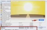
For example, editing the color of the sky is shown.
Step 1
First, the sky is selected in any way, then an adjustment layer is created Curves (curves). This automatically creates a mask from the selection that hides everything except the sky.
Attention! The foreground and background colors must be set to default before creating the adjustment layer by pressing D.

Step 2
Then, by changing the shape of the curves, the desired color and contrast are achieved.


4. Possibilities of adjustment layers
You can create several different adjustment layers.

With the help of masks and changing the opacity of layers, great editing flexibility is provided, which is unattainable with the use of conventional analogous commands. Since adjustment layers are normal layers (with some restrictions), many actions apply to them. For example, you can achieve complex effects by changing the blend modes of adjustment layers. You can also apply layer styles, use the option Blend if. You can combine adjustment layers into groups and perform operations on groups.
Another trick: in order to make the same correction of images taken in the same conditions, correct one of them with the necessary adjustment layers. Open other images. Then select the adjustment layers and drag them onto the desired images. That's it, the correction is done!
I wish you all creative success!