On the bookmark Additionally Additional options for building a query have been grouped:
Let's consider their purpose.
- First (n) - allows you to select a specified number of records, the first in the request, taking into account the specified order of records. The keyword SELECT will be generated in the request text FIRST N
- Without duplicates - will leave only unique records in the detailed records of the selection. The keyword SELECT will be generated in the request text VARIOUS
- Allowed - necessary to configure access rights restrictions; Only records allowed for these permissions will be shown (if this option is not checked, the request may fail with limited rights and return an error). In the request text, the option will generate the keyword SELECT ALLOWED
- Query type - data retrieval or temporary table creation. The temporary table option allows you to specify its name; This table can subsequently be accessed as an intermediate data source for an edited query. In this case, the keyword will appear in the request text PLACE
- Lock received data for subsequent modification - it is assumed that while reading from source tables is in progress, they are blocked for reading in other sessions. If the option is enabled, the keyword will appear in the request text FOR CHANGE. In this case, you can specify which tables among those involved in the query are blocked; If this is not done, then everything will be blocked.
Question 07.21 of exam 1C: Platform Professional. The "No duplicate records" flag on the "Advanced" tab of the query designer allows you to:
- Exclude identical rows from data source tables
- Exclude identical rows from the resulting query table. This operation applies to both detailed and summary records.
- Exclude identical rows from the resulting query table. This operation applies only to detailed records.
The correct answer is third. The uniqueness requirement does not apply to results.
Question 07.22 of exam 1C: Platform Professional. The "First 5 records" flag on the "Advanced" tab of the query designer allows you to:
- Display the first 5 records in the report. Records will be selected without taking into account the ordering rules configured in the query designer
- Display the first 5 records in the report. Records will be selected taking into account the ordering rules configured in the query designer
The correct answer is the second one, the order will be taken into account.
Question 07.23 of exam 1C: Platform Professional. The "To change" flag (in automatic transaction locking mode) on the "Advanced" tab of the query designer allows you to:
- Lock the data of the specified source tables for modification when executing a query (outside a transaction)
- Lock for reading the data of the specified source tables in the query (both outside and within the transaction)
- Lock the data of the specified source tables for reading (within a transaction)
- Answers 1 and 2 are correct
The correct answer is third. The lock is released after the processing transaction completes.
Question 07.24 of exam 1C: Platform Professional. When you set the "To change" flag (in automatic transaction locking mode) on the "Advanced" tab of the query designer, locks occur:
- At the database table level
- At the record level of database tables
- In the file server version - at the level of database tables
- In the client-server version - at the level of database table records
- Answers 3 and 4 are correct
The correct answer is fifth.
Learn more about automatic and managed transaction locks.
Question 07.25 of exam 1C: Platform Professional. When you set the "For modification" flag (in automatic transactional locking mode) on the "Advanced" tab of the query designer, the data will be locked:
- All source tables in the query
- Only virtual source tables in the query
- If the "Tables to change" list is empty, then all tables involved in the request, otherwise - only the tables specified in the list
The correct answer is the third, analysis in the post.
Question 07.47 of exam 1C: Platform Professional. When you try to execute a request with the text “Select * From Directory.Nomenclature”, if reading restrictions have been defined on the directory entry (in the corresponding role), the following will happen:
- All data will be received
- Only data from allowed records will be retrieved
- An error will occur
The correct answer is third. To avoid the situation, you need to set the "Allowed" option.
1. Methods for creating a form
2. Form builder
Ways to create a form
Having learned about 1c forms, let's move on to a deeper understanding. First, let's create a form, this can be the shape of any object, in in this example this is a reference book. There are several ways to create a form:
1. From the object constructor 2 ways
2. From the configuration tree through the context menu (right-click on the object highlighted in blue in the figure).

Form Builder
When creating a new form, the form designer window appears:

The type of form that the designer suggests choosing will affect the initial filling of elements. The main type options are:
Form of element (document, set of values)
List form
Selection form
Checkbox " Set form to main"means that if forms of this type There will be several and when you call a form of this type, if a specific one is not specified, the main one will be displayed. For example: there is a list form “ListFormShort”, which is the main one and “ListFormFull”, if you call the list form and do not specify a specific one, then “ListFormShort” will be displayed.
The main forms are visible on the “Forms” tab of the modifiable object constructor.
Checkbox " Basic list and selection form" means that this form will be displayed both for viewing the list and for selecting.
Checkbox " Basic form of element and group" means that this form will be displayed both for editing an element and for a group.
Next comes the props “ Name"it is the identifier of this form; you cannot create two forms with the same identifier for one object.
Props " Synonym" will be displayed in user mode as the name of this form.
Props " A comment» stores any notes or explanations.
Checkboxes " Command panel on top" And " Command panel below» indicate where to display command panels. A command bar is a form element that contains buttons. For example:


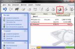
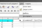
For myself, I mainly use the following method for creating a form; if the object is new, then I call the constructor from the object on the “Forms” tab, “Basic Forms” group, by clicking on the “Open” icon (magnifying glass) (Figure 1). If the object has basic forms, then I call the constructor from the metadata tree using the “Add” method from the context menu of the “Forms” branch (Figure 2).
I will make a short explanation about the connection between the form and the object. At all correct installation properties reduces the need to write code.
The form has a “Data” property; it is the main one for the form and is highlighted in bold on the “Details” tab.


What gives by setting the “Data” property is that, depending on the selected value, new events, form methods and the ability to add corresponding command bar buttons are added.
Example: " ParameterCurrentRow" - this property is available in the form module if the main attribute type is DirectoryList.
The article describes the use of the “FOR CHANGE” construction of the 1C query language. This material will be especially useful for those who want to understand the features of register locks when working with information base in the client-server version.
Applicability
The material in the article is relevant for configurations using current versions of the 1C:Enterprise platform, edition 8.3, while using the automatic data management blocking mode.
Design FOR CHANGE
Using automatic mode locks, reading without the TO MODIFY option and then writing them within the same transaction can lead to deadlocks caused by using an insufficient resource lock level.
The CHANGE clause is used to replace the shared S-lock with a U-update lock, which is less compatible with other locks:
The table contains a “+” sign if the locks at the intersection of the row and column are compatible, “–” otherwise.
Let's briefly consider the main types of blocking.
Shared (S) locks allow concurrent transactions to read a resource. As long as S-locks exist on a resource, other transactions cannot change the data.
Update locks (U) prevent a common form of deadlock from occurring. In a serializable or iterative read transaction, the transaction reads data, acquires a shared (S) lock on the resource, then performs a change to the data, which requires converting the lock to an exclusive (X) lock.
If two transactions acquire a shared lock on a resource and then attempt to update the data at the same time, one of the transactions attempts to convert the lock to an exclusive (X) lock.
Converting a shared lock to an exclusive lock will take some time because an exclusive lock on one transaction is incompatible with a shared lock on another transaction.
The wait for the lock will begin.
The second transaction will try to acquire an exclusive (X) lock for the update. Since both transactions are converting to an exclusive (X) lock, and each transaction is waiting for the other to release a shared lock, the result is a deadlock.
To avoid this potential deadlock, update (U) locks are applied. An update lock (U) can only be acquired by one transaction on a resource at a time. If a transaction modifies a resource, the update (U) lock is converted to an exclusive (X) lock.
An exclusive (X) lock prevents transactions from concurrently accessing a resource. If a resource is held by an exclusive (X) lock, then other transactions cannot change the data.
The construct TO CHANGE is specified in the query constructor on the tab Additionally:

The same tab specifies which specific tables should be blocked if the query uses several tables. If you do not specify which tables to lock, then a U-lock will be imposed on all tables specified in the query, including those that will not be written to in the future. These locks will be redundant and can create problems when several users work in parallel.
In controlled locking mode, the problem described does not exist, so the FOR CHANGE clause has no effect.
Controls are a separate group of objects designed to enter and present information in dialogs. They can be located on the form and used to edit cells in a table field or spreadsheet document.
The button is one of the most frequently used control elements in application solution forms of the 1C:Enterprise program. In this video lesson, together with you we will create the simplest 1C application object - the so-called “processing”, then we will create the main processing form and learn how to add such an important control element to this form, called "Button"
1. Creation of test processing
Hello dear friends! Roman Degtyarev is with you. Training - Center “Start in 1C”.
Read the text, and at the same time watch a short video cheat sheet, which will talk about inserting interface elements into the form of any 1C application object (including 1C processing, on the example of which we will consider this process)
A video showing the entire process is located below.
You can view this video at high quality and in full screen mode using the video playback control buttons
This will be useful to us in general, both as a basic skill in designing forms and for performing other practical exercises.
We will talk about inserting one of the types of interface elements used in any 1C:Enterprise application solution, about inserting buttons into a form.
Let's launch our educational application solution in configuration (development) mode. This instruction about the educational application solution concerns those who are studying in our 1C programming courses.
Those who are not enrolled in courses can run any existing application solution in configuration mode, including completely empty ones. This will be sufficient study for the example in question.
In order for us to have somewhere to insert buttons, we will first create some kind of separate processing in the tree of configuration objects.
So, we have entered the application solution configuration mode. Let's create the processing together. Right-click on the node “Processing” and a menu appears.
Select the item with the name in the drop-down menu "add". The visual processing designer window will open.
We can call the processing a specific name, or we can not call it - and leave the name that is assigned by default.
For example, let's give our processing a name “Test processing”. You can name it as you require if you create a processing.
After assigning a name to our processing, we can immediately click the button at the bottom of the designer window “Close”- since no other actions are required.
Test processing has been created, we see its name in the configuration tree, in the node “Processing”. Let's click on the name of our processing, expand this item and see the sub-elements that may be part of our processing: “Details”, “Forms”, “Layouts” and so on.
2. Creating the main processing form
Now it's time to create a form for our processing. The processing form is a visual representation, the main dialog box that the user will see and with which he will interact if he runs our processing.
It is analogous to a window, a form of any other program under Windows - and can include menu elements, command panels, input fields, labels, buttons, drop-down lists and other controls - all those elements that we are accustomed to when working with most regular programs.
Let's right click on the node “Forms”, then select in the appeared context menu item with name "Add"
The processing form designer window appears in front of us. With its help, at the initial stage, we can indicate some features again created form(its program name, type, whether it is the main one, etc.)
But we don’t need to make any special settings now, so we just press the button "Ready", at the bottom of the processing form designer window.
After this, the newly created 1C processing form opens in front of us.
3. Now let's look at the process of creating buttons in the processing form
So how do you insert buttons?
Please note that by default, in a newly created form, some buttons are already inserted during the design of the processing. These buttons are inserted automatically.
This standard buttons“actions” of two so-called command panels, which are located at the top of the form window and at the bottom of the window.
We are now interested in those buttons that we will insert ourselves, “manually”.
In order to insert some kind of interface element, including buttons, into the form being designed, we must click a special button with an “icon” (a yellow “plus” sign is visible on the icon), which opens a window for selecting an interface element to insert.
This special button with an “icon” is usually located on the toolbar, under the main menu of the main configurator window.
When you hover your mouse over the desired button a prompt appears “Insert Control”
.
If there is no button on the toolbar (this depends on the settings of the toolbars), we have an alternative path: When we have a form designer window on the screen in front of us, we can select the item from the main menu of the configurator: “Form”/ “Insert Control”.
Regardless of whether we clicked a button in the toolbar, or selected an action from the main menu, a special window for selecting a control element for insertion opens in front of us. The window has a title
In the window we see many different controls. (You can practice at your leisure and try inserting these elements into the form and see how they look).
Now we are interested in the element "Button". By default, after opening the window “Inserting a control”, the first element from the list of possible ones is selected for insertion, and this control element is "Button".
Selecting the type of control to insert is done on the left side of the window, and on the right side of the window you can set some properties of the element before it is inserted into the form.
That is, before inserting a control into a form, you can first “prepare” it by setting its basic properties: name, title, tooltip text when hovering the mouse, and some other properties.
For example, we can assign any element, including a “button,” a name before inserting it. This name will be the name of the object in the built-in 1C:Enterprise language, the name of the software object.
This is the name that can then be accessed from the built-in programming language.
Similarly, we can assign some kind of title to the button, an inscription on it. In our example, we will assign a title to the button “Our button” .
If we want some action to be performed in the built-in programming language when this button is pressed, then we should not uncheck the “create procedure” checkbox. By default, this checkbox is enabled.
If this checkbox is enabled, then simultaneously with inserting a button, an empty handler procedure will be created in the form's program module, in which we can write any desired algorithm that is executed when this button is pressed in user mode.
Right there in the window “Inserting a control” we can enter the tooltip text if we wish. Let's enter the input field "Clue" let's write - "This is our button" . This tooltip will appear when you hover your mouse over the inserted button.
That's it, preparation before insertion is completed, now press the button "OK".
After this window “Inserting a control” closes and now we can insert our button anywhere in our form. The mouse cursor icon is temporarily changed to a large “plus” - this way the system prompts you to use the mouse to point to a specific location on the form where we are going to insert a control.
Select a location for the button in any part of our form and press the left mouse button. Our new button is inserted into the form, and at the same time the form designer instantly switches us to the editor window of the form's software module.
It shows us the body of the click event handler for the newly inserted button. That is, we can immediately write code that will be called when the button is pressed.
Let's go back to the bookmark anyway. "Dialogue"(the form designer tabs are located at the bottom of the window) and make sure that the button appears on the form. Yes, our button is here!
We can change its size by “pulling the mouse” on the corner of the button, or move our button somewhere within the form window.
And by going back to the program module (tab "Module") -we can write code in a programming language to perform actions when our button is pressed.
Let’s write some code, let it, for simplicity, consist of just one line “ Notify(“Our button is pressed!”); ”
This code will cause the following text to appear on the user’s screen in the service message window when the button is pressed: “Our button has been pressed.”
Let's check and launch our application solution in user mode.
Next, select the item in the main menu “Operations”/”Processings”. Let's remember that we created a processing and named it “Test processing”, so we select processing with this name from the list that opens.
Tmk, we see in front of us the form of our processing. In the form we see our button with a title “Our button” . Please note, hint “This is our button” appears when you hover your mouse over the button.
Now let's press the button. We make sure that the message that we have programmed is displayed in the service message window: “Our button has been pressed” .
In a similar way, we can insert any other controls that we will talk about with you in our courses and video cheat sheets.
Summary: We have successfully inserted a button on the processing form, and now you should be able to do it. See you in video tutorials.
Roman Degtyarev was with you.
Training center “Start in 1C”
How to learn to program in 1C from scratch?
How to work as a 1C programmer and earn up to 150,000 rubles per month?

SIGN UP FOR FREE
2 WEEK COURSE
"PROGRAMMING IN 1C FOR BEGINNERS"

The course will come to email. Become a programmer by completing step-by-step tasks.
To participate you only need a computer and the Internet
Free access to the course:
Sp-force-hide ( display: none;).sp-form ( display: block; background: #eff2f4; padding: 5px; width: 270px; max-width: 100%; border-radius: 0px; -moz-border -radius: 0px; -webkit-border-radius: 0px; font-family: "Helvetica Neue", sans-serif: no-repeat; background-size: auto;) .sp-form input ( display: inline-block; opacity: 1; visibility: visible;).sp-form .sp-form-fields-wrapper ( margin: 0 auto; width: 260px;).sp-form .sp -form-control ( background: #ffffff; border-color: #cccccc; border-style: solid; border-width: 1px; font-size: 15px; padding-left: 8.75px; padding-right: 8.75px; border -radius: 4px; -moz-border-radius: 4px; -webkit-border-radius: 4px; width: 100%;).sp-form .sp-field label ( color: #444444; font- size: 13px; font-style: normal; font-weight: bold;).sp-form .sp-button ( border-radius: 4px; -moz-border-radius: 4px; -webkit-border-radius: 4px; background-color: #f4394c; color: #ffffff; width: 100%; font-style: normal; font-family: Arial, "Helvetica Neue", sans-serif; box-shadow: none; -moz-box-shadow: none; -webkit-box-shadow: none; background: linear-gradient(to top, #e30d22 , #f77380);).sp-form .sp-button-container ( text-align: center; width: auto;)
So, let's begin. For clarity, I will create a form props with .

Let's place the new details on the form. This can be done in two ways.
The first method: simply drag the desired attribute into the elements tab with the mouse.

The second method: add a new form element with the Field type, and associate it with the desired one using the element property PathToData.


I'll drag a prop with type Boolean and it will automatically be set to look like Checkbox field.

We are not interested in the flag itself. A much more interesting property Checkbox type, which can take three values – Auto, Checkbox And Tumblr.

If we set this property to Tumblr, then our form will take more beautiful view.

Of course, when the toggle switches have the names True and False written on them, it's not very pretty. Let's change them to more familiar ones. To do this, we will use the element property Editing Format, where on the bookmark Boolean Let's set the names of the toggle switch buttons that are more suitable for us.

After this, our toggle switch will look more beautiful. If we want to remove or move the position of the title, then for this we need the element property Header Position. which takes a lot different meanings, including the meaning – No.

More detailed work with form elements using practical examples is given in the book “Basics of development in 1C: Taxi. Managed Application Development in 12 Steps".
Sometimes it seems that learning the programming language in 1C is difficult and difficult. In fact, programming in 1C is easy. My books will help you quickly and easily master programming in 1C: and “Basics of development in 1C: Taxi”

Learn programming in 1C with the help of my book “Programming in 1C in 11 steps”
- No complicated technical terms.
- Over 700 pages of practical material.
- Each task is accompanied by a drawing (screenshot).
- A collection of problems for homework.
- The book is written in a clear and in simple language- for a beginner.

This book is suitable for those who have already started programming and are experiencing certain difficulties with this topic and for those who have been programming for a long time, but have never worked with 1C managed forms.
- Without complex technical terms;
- More than 600 pages of practical material;
- Each example is accompanied by a drawing (screenshot);
- The book is sent by email in PDF format. Can be opened on any device!
Promo code for a 15% discount - 48PVXHeYu
If this lesson helped you solve any problem, you liked it or found it useful, then you can support my project by donating any amount:
You can pay manually:
Yandex.Money - 410012882996301
Web Money - R955262494655
Join my groups.